Our Logo
On 3 May 2023, André sent me an email asking for support for the traveling circus. A logo was needed. I am already familiar with the project from the application. Initial requirements: The logo/adventure should contain the following points - at least that’s how we envision it now:
-
the visual identity is colorful (7 or more colors) but not gaudy, see the cover of an album as an example;
-
the hand-drawn logo should be simple in the sense of “This is Santa’s house” or “Dot, dot, comma, dash - that’s the moon face”, so that anyone can draw it quickly and it is always recognizable despite all the individuality, but you never have a “perfect” logo as a comparison
-
therefore something hand-drawn rather than a vector graphic
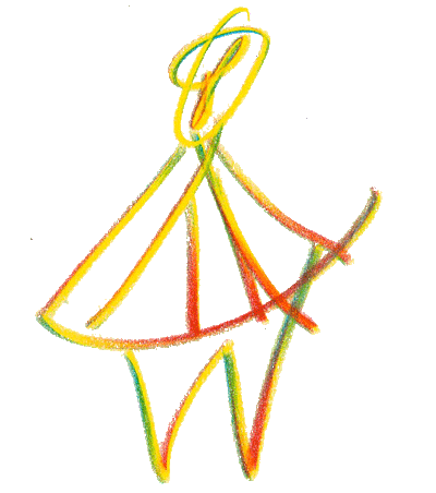
This mail already contains a picture of a hand-drawn sketch: It looks like a figure consisting of the elements of a circus tent, only with a head at the top.
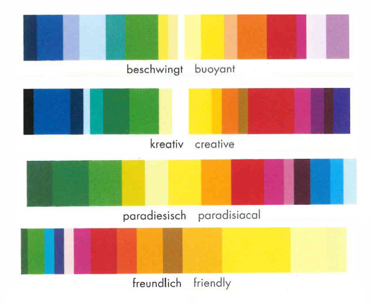
With these guidelines, we get to work. To get an even better feel for where the logo could go, I send André and Lucía a semantic differential and ask them to fill it in.
The question is: “What should the logo look like?”
The answer of the 2 is: lively, creative, paradisiacal, friendly.
From these results, I derive colors for the traveling circus with the help of Axel Venn’s color dictionary. The color climates are beautiful, colorful and indeed upbeat.
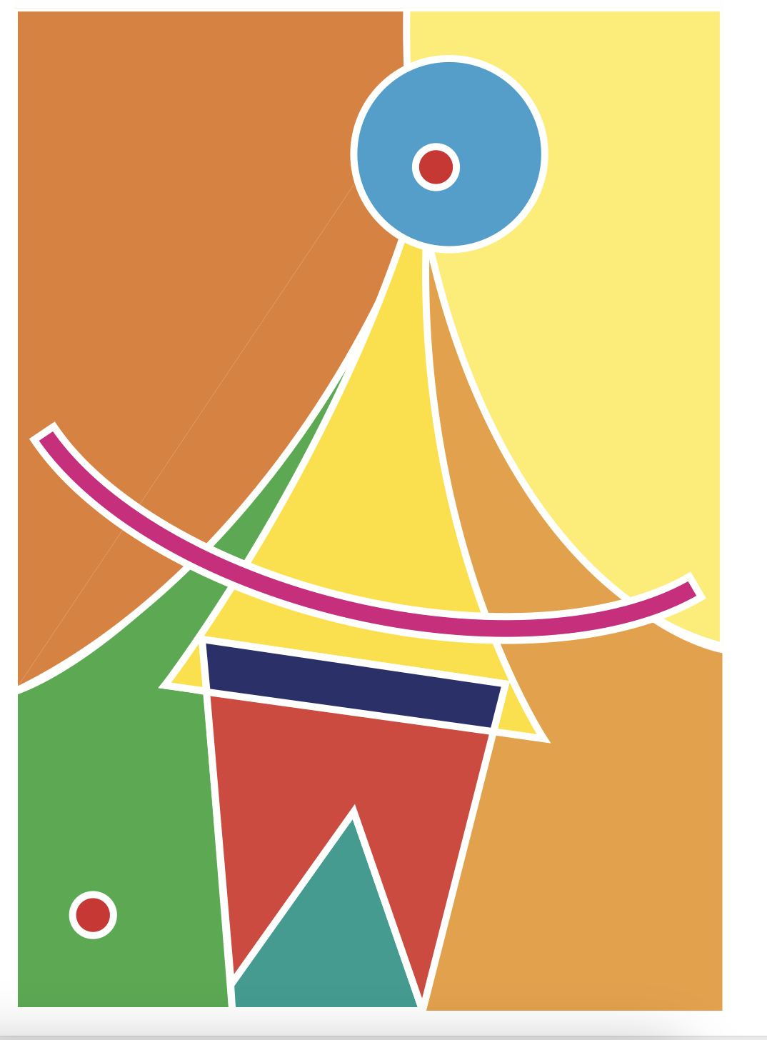
I work on my first approaches in an hour of inspiration. I try to work with the colors in areas. The template is always the hand sketch that André sent in the first email.
The color areas are very static, I place the figure on the color areas… but I’m a bit unhappy with everything.
Luckily, we discuss it and it becomes clear that the figure is best suited to the ideas as a line drawing. This resulted in many drawings of the figure. In my case, there are probably 50 or more. I work with markers and try to draw the individual lines of the figure in different colors. Sometimes this is more or less successful. Nevertheless, a sequence of colors emerges, a first kind of system…
We meet again and exchange the results. I also picked out fonts and set a line of many different fonts. It looks good on its own, but it’s a bit overdone…
In the meeting we also look at André’s and Lucía’s drawings and we realize that the figure (I had drawn it very statically) can also move. It also becomes clear that there is perhaps not just one figure that works as a logo, but many… The figure can adopt different postures, dance, balance, be tall or short, plump or slim.
In further attempts, I no longer draw with markers. I try different pens and finally end up with wax crayons and pastels. These create a dynamic line that makes the structure of the different papers visible. This emphasizes the character of the hand drawing even more and works very well, resulting in perhaps another 30 to 40 drawings, many of which I scan and place in the MURAL.
In another meeting, we realize that this is it. Lucía and André also continued drawing with different pens and tools.
Conclusion: All of them are somehow beautiful.
Conclusion: Maybe they are all the logo
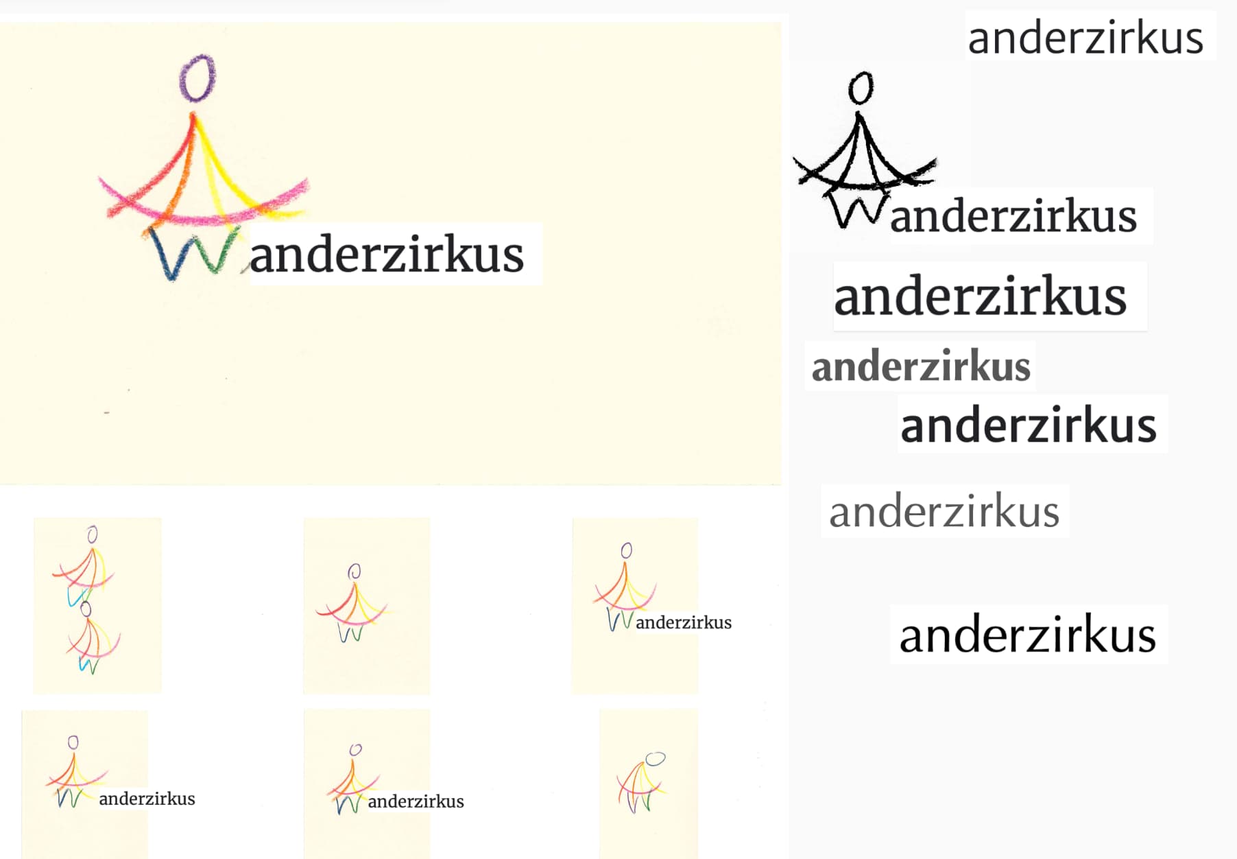
I complement the figure with simple lettering in modern Antiqua, with and without serifs. One of the serif fonts fits perfectly.
This could be it. The logo consists of a figure and lettering. The figure essentially consists of 7 to 8 lines - it looks like the elements of a circus tent and has a circle at the top as a head (see beginning). Each line and the head are in a different color from the color spectrum.
So the figure can be drawn, glued, brushed or scratched by anyone. It will always look different, but will be recognizable at its core… + a lettering.
That’s it!